Covering the Public Purse with OpenSpending.org
Written by: Lucy Chambers

In 2007, Jonathan came to the Open Knowledge Foundation with a one page proposal for a project called Where Does My Money Go?, which aimed to make it easier for UK citizens to understand how public funds are spent. This was intended to be a proof-of-concept for a bigger project to visually represent public information, based on the pioneering work of Otto and Marie Neurath’s Isotype Institute in the 1940s.
The Where Does My Money Go? project enabled users to explore public data from a wide variety of sources using intuitive open source tools. We won an award to help to develop a prototype of the project, and later received from Channel 4’s 4IP to turn this into a fully fledged web application. Information design guru David McCandless (from Information is Beautiful) created several different views of the data which helped people relate to the big numbers — including the ‘Country and Regional Analysis’, which shows how money is disbursed in different parts of the country, and ‘Daily Bread’, which shows citizens a breakdown of their tax contributions per day in pounds and pence.

Around that time, the holy grail for the project was the cunningly acronymed Combined Online Information System (or COINS) data, which was the most comprehensive and detailed database of UK government finance available. Working with Lisa Evans (before she joined the Guardian Datablog team), Julian Todd and Francis Irving (now of Scraperwiki fame), Martin Rosenbaum (BBC) and others, we filed numerous requests for the data — many of them unsuccessful.
When the data was finally released in mid 2010, it was widely considered a coup for transparency advocates. We were given advance access to the data to load it into our web application, and we received a significant attention from the press when this fact was made public. On the day of the release we had dozens of journalists showing up on our IRC channel to discuss and ask about the release, as well as to enquire about how to open and explore it (the files were tens of gigabytes in size). While some pundits claimed the massive release was so complicated it was effectively obscurity through transparency, lots of brave journalists got stuck into the data to give their readers an unprecedented picture of how public funds are spent. The Guardian live-blogged about the release and numerous other media outlets covered it, and gave analyzes of findings from the data.
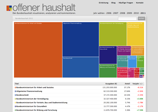
It wasn’t long before we started to get requests and enquiries about running similar projects in other countries around the world. Shortly after launching OffenerHaushalt — a version of the project for the German state budget created by Friedrich Lindenberg — we launched OpenSpending, an international version of the project, which aimed to help users map public spending from around the world a bit like OpenStreetMap helped them to map geographical features. We implemented new designs with help from the talented Gregor Aisch, partially based on David McCandless’s original designs.
With the OpenSpending project, we have worked extensively with journalists to acquire, represent, interpret and present spending data to the public. OpenSpending is first and foremost an enormous, searchable database of public spending — both high level budget information and transaction-level actual expenditure. On top of this are built a series of out of the box visualizations such as treemaps and bubbletrees. Anyone can load in their local council data and produce visualizations from it.
While initially we thought there would be a greater demand for some of our more sophisticated visualizations, after speaking to news organizations we realised that there were more basic needs that needed to be satisfied first, such as the the ability to embed dynamic tables of data in their blogposts. Keen to encourage news organizations to give the public access to the data alongside their stories — we built a widget for this too.
Our first big release was around the time of the first International Journalism Festival in Perugia. A group of developers, journalists and civil servants collaborated to load Italian data into the OpenSpending platform, which gave a rich view of how spending was broken down amongst central, regional and local administrations. It was covered in Il Fatto Quotidiano, Il Post, La Stampa, Repubblica, and Wired Italia, as well as in the Guardian.

In 2011 we worked with Publish What You Fund and the Overseas Development Institute to map aid funding to Uganda from 2003-2006. This was new because for the fist time you could see aid funding flows alongside the national budget — enabling you to see to what extent the priorities of donors aligned with the priorities of governments. There were some interesting conclusions, for example both counter HIV programmes and family planning emerged as almost entirely funded by external donors. This was covered in the Guardian.
We’ve also been working with NGOs and advocacy groups to cross-reference spending data with other sources of information. For example, Privacy International approached us with a big list of surveillance technology companies and a list of agencies attending a well known international surveillance trade show, known colloquially as the ‘wiretappers ball’. By systematically cross-referencing company names with spending datasets, it was possible to identify which companies had government contracts — which could then be followed up with FOI requests. This was covered by the Guardian and the Wall Street Journal.
We’re currently working to increase fiscal literacy among journalists and the public as part of a project called Spending Stories, which lets users link public spending data to public spending related stories to see the numbers behind the news, and the news around the numbers.
Through our work in this area, we’ve learned that:
-
Journalists are often not used to working with raw data, and many don’t consider it a necessary foundation for their reporting. Sourcing stories from raw information is still a relatively new idea.
-
analyzing and understanding data is a time-intensive process, even with the necessary skills. Fitting this into a short-lived news cycle is hard, so data journalism is often used in longer-term, investigative projects.
-
Data released by governments is often incomplete or outdated. Very often, public databases cannot be used for investigative purposes without the addition of more specific pieces of information requested through FOI.
-
Advocacy groups, scholars and researchers often have more time and resources to conduct more extensive data-driven research than journalists. It can be very fruitful to team up with them, and to work in teams.
